Dear readers, With the launch of e-newsletter CUHK in Focus, CUHKUPDates has retired and this site will no longer be updated. To stay abreast of the University’s latest news, please go to https://focus.cuhk.edu.hk. Thank you.
Rising Like a Phoenix
If there’s any unit in the University that recognizes that building a brand is no trivial matter, it’s the Faculty of Business Administration. In 2011, the Faculty became known as the ‘CUHK Business School’ to align itself with the practice of most other leading institutions in the world. With the new appellation came a refreshed logo that is designed to create a modern, international and engaging visual identity.
‘The re-branding exercise was an ideal opportunity to engage with our stakeholders and to develop a single, unified brand identity. The re-brand and logo system is making a clear difference towards our goal of reaching out to the global world,’ remarked Prof. Kalok Chan, Dean of the Business School.
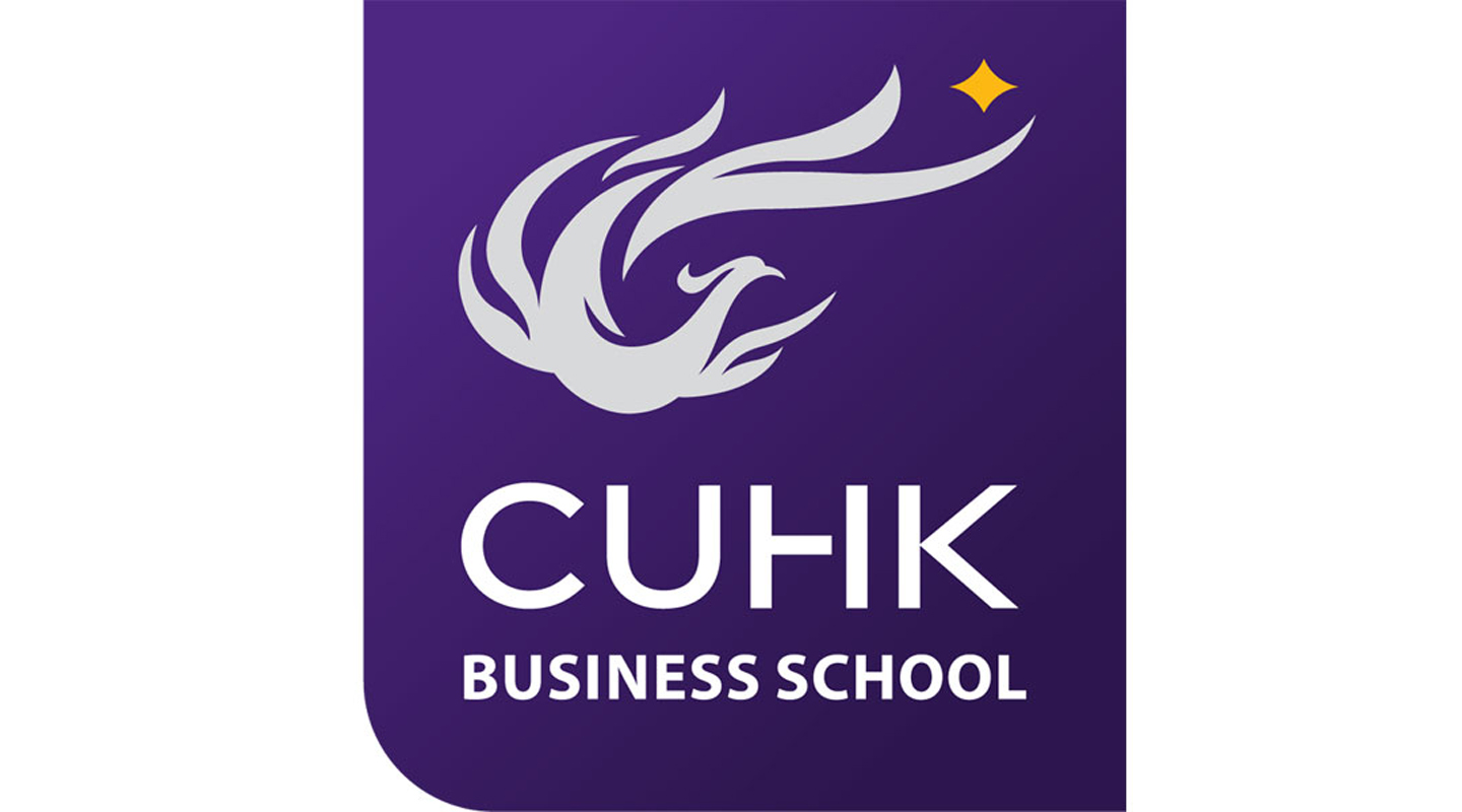
The new logo draws inspiration from CUHK’s emblem of a phoenix but adds a sense of modernity and movement. For the Business School, the phoenix features a forward-facing head and wings, hinting at the School’s vision in nurturing business leaders who point the way to the future. The tail feathers of the legendary bird reflect the shape of dancing flames, rendered in an elegant curve to form the letter C for CUHK, symbolizing that the School builds and thrives upon the strengths and traditions of its mother brand. To the right and above the tail shines a star-like spark, which conveys the notion of enlightenment and knowledge creation.
The pearl grey phoenix and the orange yellow spark are nicely set off by the logo’s background colour of regal purple. ‘Purple signals loyalty and devotion, yellow perseverance and resolution, and pearl grey professionalism and confidence. The latter is also a subtle tribute to the location of the Business School and its presence in the Pearl River Delta,’ explained Mr. Roger Shew, the School’s Director of Marketing and Communications.
The identity, with all its elements, is housed in a four sided holding shape with a rounded lower left corner, creating a well-defined emblem in itself and giving a sense of stature, strength as well as flexibility.
Going with the new logo and brand identity is a 100-page brand guideline, covering a full range of applications from how to create a decorative spark pattern for a banner to how to apply the phoenix graphics on a polo shirt. The second edition of the brand guideline has recently won an Honours Award at the Galaxy Awards 2016 New York USA, a prestigious international marketing competition. Other units take note: a brand is more than that which meets the eye.
This article was originally published in No. 486, Newsletter in Nov 2016.