Dear readers, With the launch of e-newsletter CUHK in Focus, CUHKUPDates has retired and this site will no longer be updated. To stay abreast of the University’s latest news, please go to https://focus.cuhk.edu.hk. Thank you.
A Word in the Hand
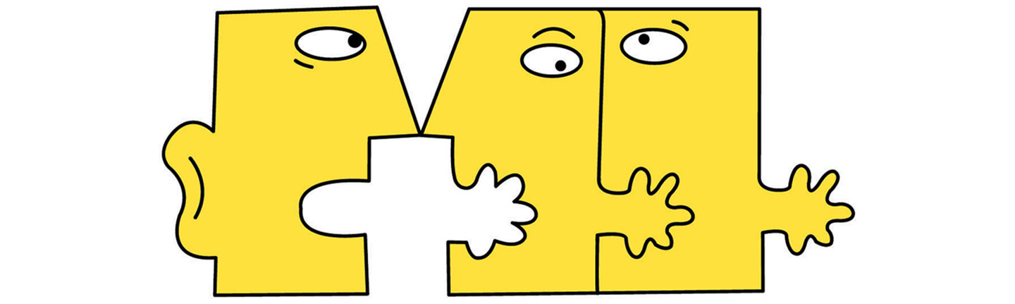
Sign language, instead of being a simple collection of hand gestures, is a natural language with a full-fledged grammatical system, and facilitates rather than impedes the development of spoken languages for deaf people. That is the message CUHK’s Centre for Sign Linguistics and Deaf Studies has been spreading for the past decade. Founded by Prof. Gladys Tang and Prof. James Woodward in 2003, the Centre devotes itself to bridging the hearing and the deaf worlds, a mission that is clearly reflected in its delightful, eye-catching logo.
The logo comprises three stylized, interconnected human faces. The prominent ear of the left one shows that it belongs to a hearing person. Mouth wide-open, it is chatting animatedly with the presumably deaf person in the middle. The latter’s mouth is in the shape of a hand which can also be viewed as an extension of the hand of the hearing. One may infer that these two faces are using sign language as well as speech to communicate.
The extending hands of the centre and the right faces convey the notion of reaching out into the hearing and the deaf worlds. The series of mouths/hands form a connective chain that can be added on ad infinitum, signifying that sign bilingualism boosts social inclusion.
The three hands in the logo further allude to the existence of different sign languages in the world. It is a common misconception that sign language is universal. In fact, each country has developed its own native sign language.
Facial expression is also a key component of the logo. The hyper-expressiveness of the faces is rendered by some simple positionings of the eyebrows and eyeballs. A third lesson is embedded in the logo: facial and bodily movements are part of the grammar of a sign language.
The logo adopts the single colour of lemon yellow traced in black contours. Yellow is a colour that invokes warmth and happiness. Generally it doesn’t play a central role in logo design and is sparingly used to highlight important features. Used alone and enclosed by solid lines, the colour makes the Centre’s logo stand out even when it is in a crowded surrounding, and guarantees it is the first thing you will notice on the Centre’s website or an event flyer.
On top of embodying the Centre’s spirit, the logo, designed by Brian Lau and Lilian Chan of Mad Studios, won the second prize in the 2005 winter semi-annual design contest as part of the American Design Awards. The three cute figures in the logo become not only the face of the Centre, but also that of a good design.
This article was originally published in No. 488, Newsletter in Dec 2016.
Read More: