Dear readers, With the launch of e-newsletter CUHK in Focus, CUHKUPDates has retired and this site will no longer be updated. To stay abreast of the University’s latest news, please go to https://focus.cuhk.edu.hk. Thank you.
Beyond the Binary: Gender Studies Programme
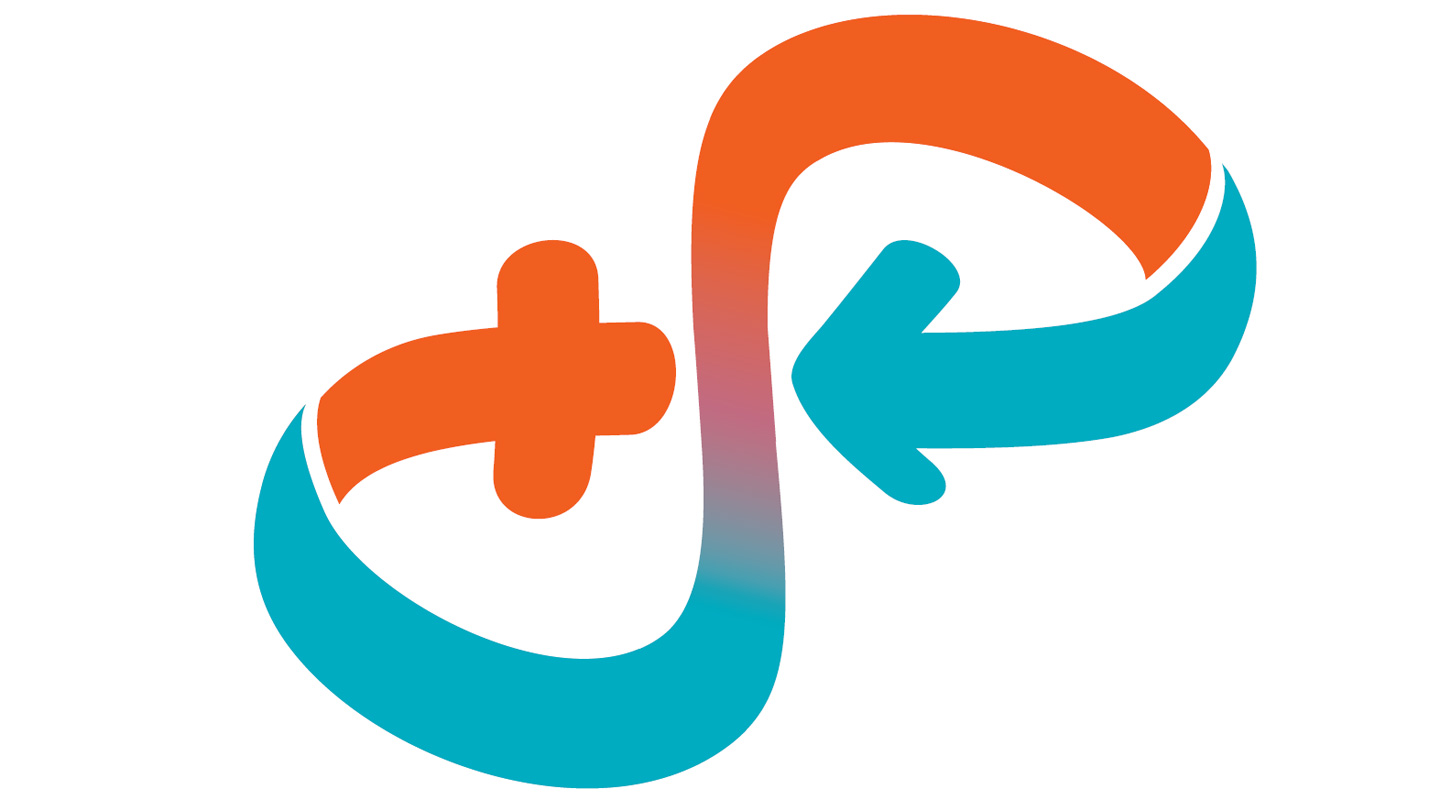
The issue of gender is much more complex and nuanced than most people realize, as it is not as simple as the binary opposition of male and female. The line dividing the two is indeed wide and fluid. This is an important topic covered in the classes of CUHK’s Gender Studies Programme, and also a key message reflected in the Programme’s logo design.
Traditionally, the two standard gender symbols are the Mars symbol ♂ that depicts the shield and spear of the god of war, and the Venus symbol ♀ that depicts the bronze mirror with a handle of the goddess of love and beauty. The designer of the Programme’s mark took out the arrow from the male symbol and the cross from the female to form a sideways infinity sign, denoting the Programme’s aspiration to break down gender dichotomy and promote inclusivity and acceptance.
The cross adopts the colour of bright orange and the arrow turquoise, defying the stereotypes that pink is for the girl and blue for the boy. Orange is the colour of joy that gives a sense of warmth and enthusiasm, while turquoise, meaning ‘Turkish stone’ as it came to Europe from Turkey, is associated with serenity, wisdom and patience. The strong contrast reminds us what is possible when unique individuals join hands for the benefit of all.
Colour gradient is found on the S-curve that links the gender signs together. It conveys the message that as opposed to having only two endpoints, gender is a spectrum that embodies many variations, like people who are genderfluid, androgynous, transgender, etc. It also acknowledges that there are various ways in which people externally communicate their gender identity to others through behaviour, clothing, haircut, voice and other forms of gender expressions.
With the cross and the arrow sweeping inward and pointing at the centre, the logo represents women, men and all other genders working together to make gender equality a reality. It is also a reminder that although gender is complicated and gender identities come with numerous labels, we don’t need to remember and distinguish every one. What we need to do is leave room for variety, show respect for differences, and let people be themselves.
Christine N.
This article was originally published in No. 517, Newsletter in May 2018.