Dear readers, With the launch of e-newsletter CUHK in Focus, CUHKUPDates has retired and this site will no longer be updated. To stay abreast of the University’s latest news, please go to https://focus.cuhk.edu.hk. Thank you.
Letter by Letter: Centre for Quality of Life
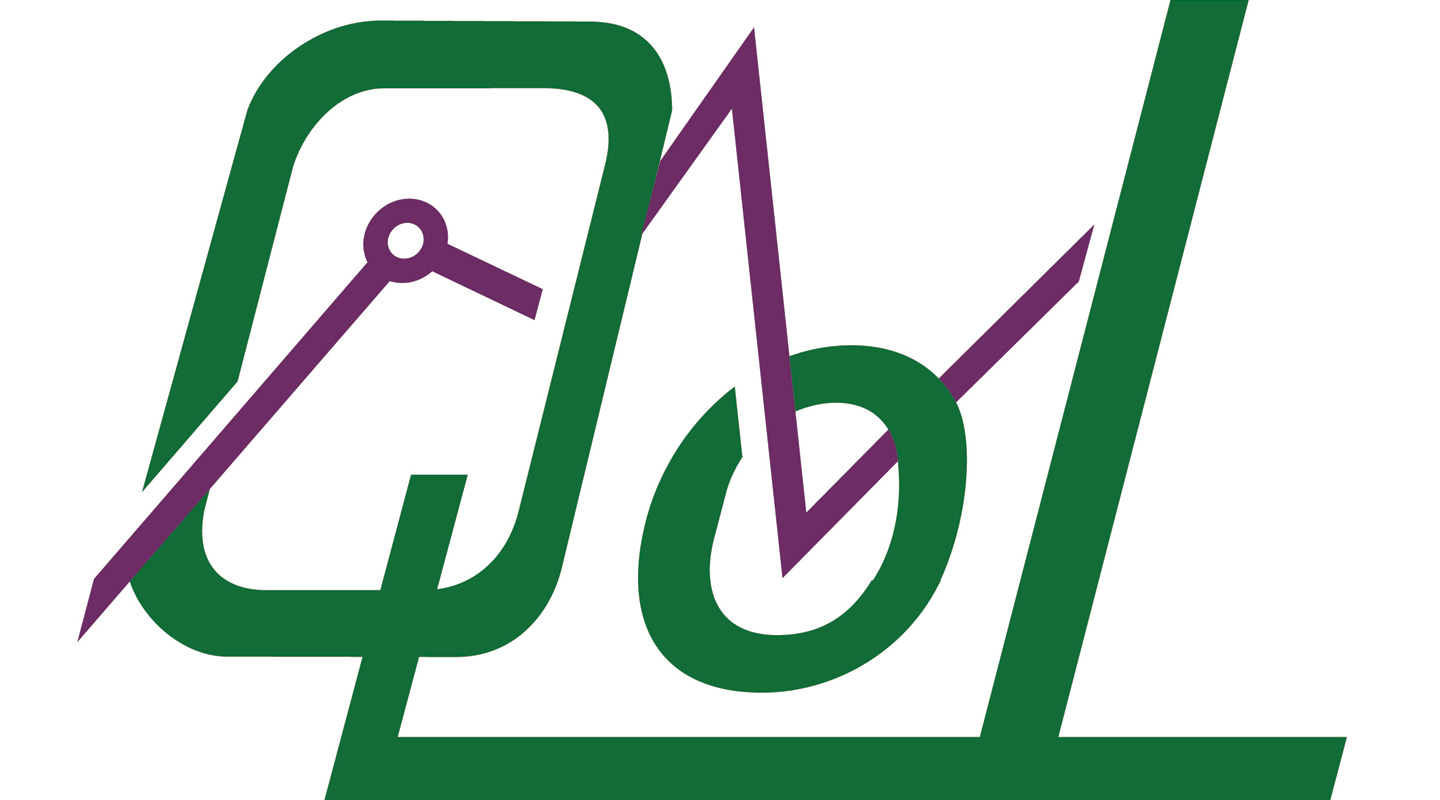
A lettermark is one of several different types of logos, and is among the most common. As opposed to the pictorial marks (e.g., the bitten apple for Apple, or the blue bird for Twitter), a lettermark has the benefit of containing the initials of a company or an organization (e.g., HP, IBM) to allow for instant brand recognition. The lettermark is all about simplicity, but it doesn’t always mean a barebone typography. Employing graphics to interact with letters can make for a memorable identity. This is the case with CUHK’s Centre for Quality of Life.
The Centre’s logo builds on the ‘QoL’ acronym and adopts the colour of dark green, which we associate with vitality, health and wealth, some of the factors that determine quality of life.
The letter ‘o’ is set in lowercase, flanked by the hefty capital letters ‘Q’ and ‘L’. The three letters tilt to the right, the tail of the stylized ‘Q’ aligned with the crossbar of the ‘L’, conveying a sense of energy, modernity and also uniqueness.
An angular, purple line with a tiny circle at the first peak zigzags through the bowl of the letter ‘Q’ and the loop of the ‘o’. It is a symbol of the ‘CUHK Hong Kong Quality of Life Index’. The Index was initiated by the Faculty of Social Science in 2003, which aims to measure and keep track of Hong Kong’s quality of life in the 21st century, and to provide policy-makers and the community with a useful reference. In 2006, the Centre for Quality of Life was set up to continue the research and release the latest Index on an annual basis.
Incorporating the graphic element into the lettermark is a stroke of genius, for it instantly adds boldness and visual distinction to the name.
It is also notable that similar to a lettermark, a wordmark logo is made up of words (e.g., Google, Coca-Cola) that make up the organization’s name. A wordmark logo works well with a short and easily pronounced name, while a lettermark logo can reduce a long and formal one to manageable and hence memorable length (How much easier is it to remember UNESCO instead of the United Nations Educational, Scientific and Cultural Organization?). If you’re thinking of creating a logo as a lettermark, make sure the initials not only look good together, but also are legible and can’t be misread when you place the icon in print or online.
Christine N.
This article was originally published in No. 503, Newsletter in Sep 2017.