Dear readers, With the launch of e-newsletter CUHK in Focus, CUHKUPDates has retired and this site will no longer be updated. To stay abreast of the University’s latest news, please go to https://focus.cuhk.edu.hk. Thank you.
Building a Logo
17 October was a big day for CUHK, which turned 55 on that day. Celebrations for the University’s 55th anniversary are going to take place throughout the year till next October. In the coming 12 months, the logo specially designed for the anniversary will show its face in various University events and publications and play a part in the lives of CUHK members.
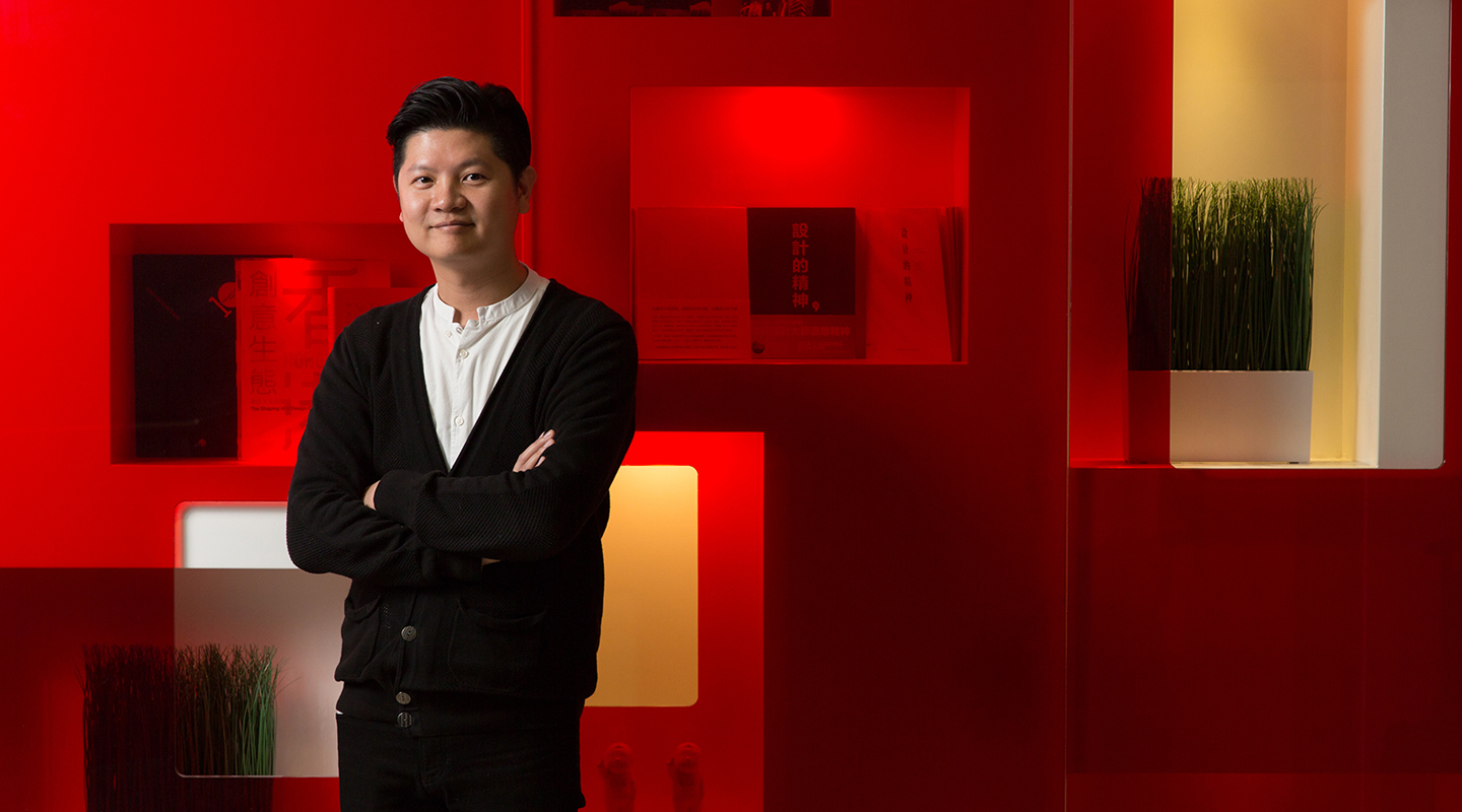
The anniversary logo was designed by local architect and designer Karr Yip, a CUHK alumnus who read Fine Arts and subsequently Architectural Studies. He is now the chairman of the Hong Kong Designers Association.
The University’s motto, ‘Through learning and temperance to virtue’, provides an entry point for the design of the logo. ‘In the past 55 years, CUHK has sowed the seeds of learning and temperance, whose wonderful fruits are borne in each and every one of its students. With the logo, I hope to prompt students and alumni to contemplate on the essence of CUHK education, and to persist in the quest for the good in the fast-changing digital era.’
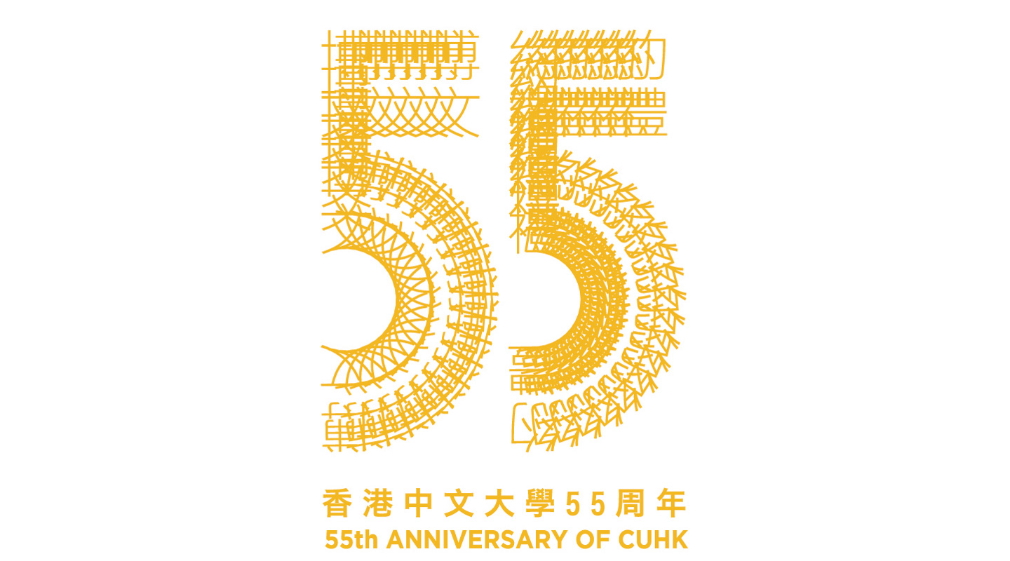
Made up of the Chinese motto and anniversary numerals, the complex-looking logo belies its simple design logic: the first double-layered ‘5’ is generated through repeating the two Chinese characters (博文)that stand for ‘learning’. The vertically-oriented characters repeat themselves first from right to left, then downwards and in a semi-circular manner. The second ‘5’ denoting the other term ‘temperance’ in Chinese (約禮)is produced in the same manner.
As the four constitutive Chinese characters vary in their number of strokes and morphology, the ‘5’s formed with their repetitions boast an intriguing kaleidoscopic texture. One may say they are like laces, serrations or even iron tracks. Yielding a strong visual effect, this design cunningly mobilizes and makes manifest the aesthetics of Chinese script.
Such an ingenious conception boils down to Karr’s background in architecture. ‘However grand it may be, a building is ultimately made up of piecemeal materials. It is the task of an architect to think about how to mix and match a large amount of small objects, and compose them into the shape he wants.’
Building a logo in an architectural way also gifts the whole design with a touch of modernity. ‘The message I want to bring out is although CUHK is rooted firmly in its tradition, it is by no means conservative. Rather, it distils the cherished wisdom of Chinese culture into the modern, technologically advanced world.’
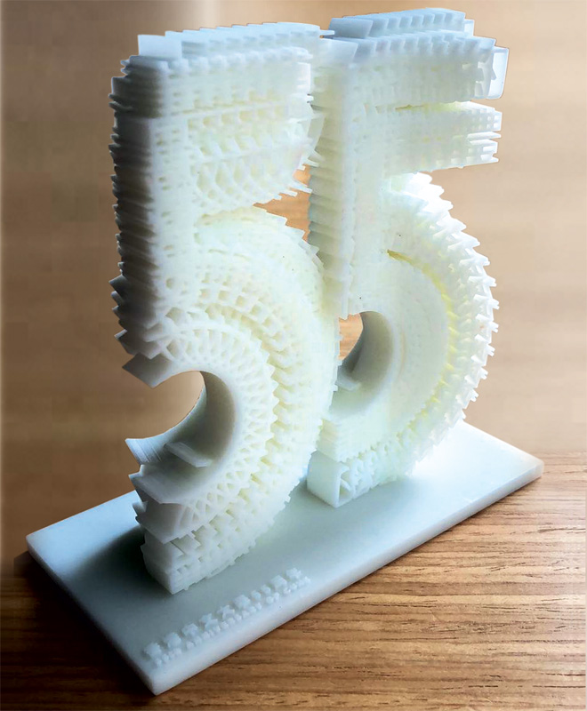
For a two-dimensional logo image, one can only enlarge or minimize it. What’s so special about this anniversary logo is that it is created by an architectural software that enables the easy production of a concrete three-dimensional (3-D) model.
When the logo is used on 2-D publications, Karr reminds us to attend to its colour combinations. Gold and silver are the logo’s preferred colours, and hot stamping foils in the said colours would give accent to its nuanced textures. A gold logo is perfect for a white background, while its silver peer would serve a black background well.
Vice-President (Administration) and Chairman of the 55th Anniversary Celebration Organizing Committee, Mr. Eric Ng said, ‘To showcase the achievements of CUHK and its contributions to society in the past 55 years, a wide spectrum of activities has been planned. All units are welcome to use the logo in their correspondences to help publicize the anniversary and to encourage all CUHK members to join in the celebrations.’
Christine N.
Watch video to learn more:

This article was originally published in No. 525, Newsletter in Oct 2018.