Dear readers, With the launch of e-newsletter CUHK in Focus, CUHKUPDates has retired and this site will no longer be updated. To stay abreast of the University’s latest news, please go to https://focus.cuhk.edu.hk. Thank you.
SJC: Le Rouge et Le Noir
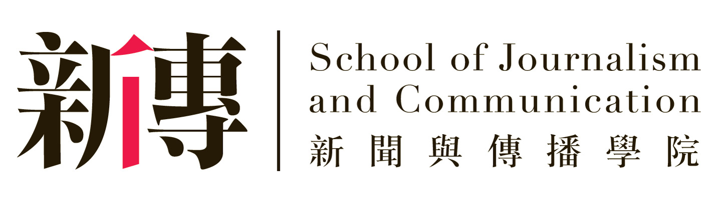
In celebration of the School of Journalism and Communication’s 50th anniversary in 2015, a new school logo and brand identity had been developed and launched in 2013 to foster a greater sense of belonging among its members as well as to enhance brand recognition and awareness.
‘While many similar schools may tend to highlight their advanced media technology, our School, which is located in the Humanities Building of New Asia College, considered our humanistic orientation as one of our most distinctive features,’ remarked Prof. Anthony Fung, Director of the School.
The designer then came up with the idea to combine the two characters in the School’s abbreviated Chinese name—‘xin’(新, journalism) and ‘chuan’(傳, communication)—to create a logo. The Chinese character ‘ren’ (亻, people) appears in the intersection of the two characters, coloured in red to highlight the School’s emphasis on humanism and its mission to educate communicators with a strong commitment to professional ethics and social responsibility.
The left character, ‘xin’(新), can also mean ‘novel’ or ‘innovative’. The right character, ‘chuan’(傳), can mean ‘inheritance’. Taking away the ‘ren’ (亻) part, the right character becomes ‘zhuan’(專), meaning ‘specialized’ or ‘professional’. The designer has thus created a logo in which the components of the characters resonate with the School’s tagline—‘to inherit, to innovate, to inspire’.
The Red and the Black have both combined and distinguished the two characters in the logo, dictating the eyeball and emphasizing in turn the two core academic components of the School. The visual identity is as strong and professional as the School’s curriculum and reputation.
In the rest of the mark, the full name of the School is given in Chinese and English typefaces which were carefully selected by the brand designer to achieve visual harmony. Both are in high contrast in the strokes. These serif typefaces look classic, elegant and professional, which are appropriate for an institution with a well-established academic legacy.
The brand typography and colours of the logo have been adopted into the School’s website. The official site is not merely a platform to deliver information but serves as an integral part of the School’s brand identity. A webpage entitled ‘People’ is dedicated to presenting the unique personality and style of each faculty member through a series of professionally taken images. The design re-affirms the importance of human elements in education and also demonstrates the never-ceasing passion of its members to stay creative as they communicate their brand identity across a variety of media platforms.
This article was originally published in No. 493, Newsletter in Mar 2017.