Dear readers, With the launch of e-newsletter CUHK in Focus, CUHKUPDates has retired and this site will no longer be updated. To stay abreast of the University’s latest news, please go to https://focus.cuhk.edu.hk. Thank you.
Graceful yet Forceful: Department of Chinese Language and Literature
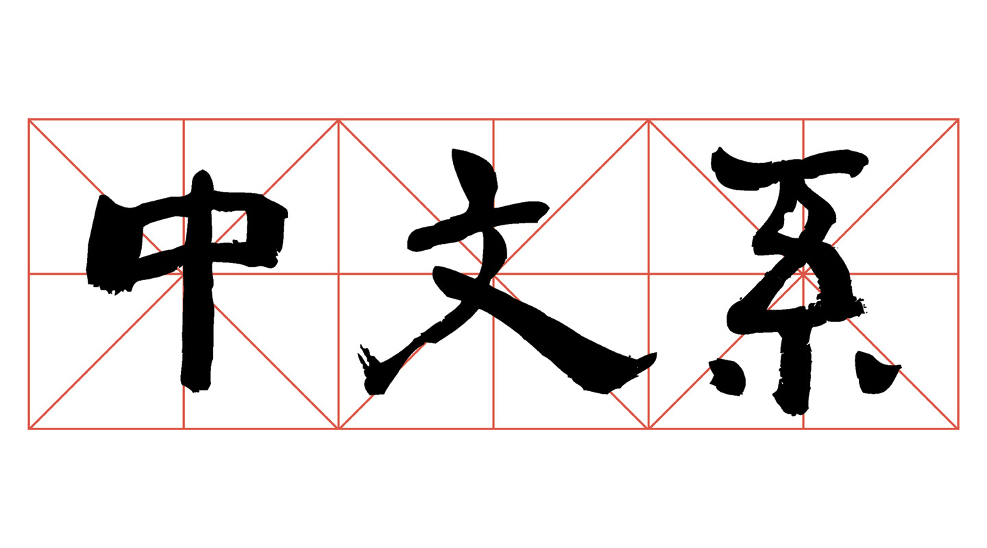
The logo of the Department of Chinese Language and Literature comprises three Chinese characters written in calligraphic form. They are translated as the ‘Chinese Language Department’, which is the Department’s name for short. Little do people know that the characters were written by the world-renowned sinologist the late Prof. Jao Tsung-I. The story must be traced back to 2002, when Professor Jao was originally invited to inscribe for the Hong Kong Literature Research Centre founded on the donated books and research materials of Prof. Lo Wai-luen. In addition to the full Chinese name of the Centre, the inscription also includes nine Chinese characters that stand for the Department which is the Centre’s governing unit. About 10 years later, when the Department needed to redesign its logo, Prof. Ho Che-wah remembered this inscription and made use of the relevant characters in it.
The reason why these three simple-structured characters are so unforgettable for him is that the simpler a character is, the harder it is to bring out its essence. Yet, Professor Jao has graced the characters with a touch of unsophisticated elegance, breathing life into this very calligraphy. ‘Professor Jao wrote the characters in regular script with a twist of clerical script. In terms of structure, it is plain and simple; in terms of stroke, the use of thick and heavy stroke conveys a sense of forcefulness but nevertheless manages to appear lively and vivid,’ Professor Ho remarked.
The thickness is mainly manifested in the character ‘中’, in which the down stroke usually ends with a lifting serif to create a sense of spike and sharpness. Professor Jao, however, ended the down stroke with a steady and heavy down-lift, indicating that the Department never strays from the right path of prudence, fairness and righteousness. The slashes in ‘文’ provide a sense of liveliness with the endings winging out, weaving nobility and vitality together.
Red diagonal grids used in calligraphy practice are added to the background. They create a three-dimensional effect that visually pushes the three characters forward. The bright red hue against the jet black ink also smartens up the overall design.
The three characters are made into three-dimensional models, and are inlaid vertically into a glass wall in front of the Department office. Next to the three characters, a horizontal display of the Department’s full Chinese name shall be read from right to left. The full name of the Department in English is presented in fresh orange, arranged from left to right under the Chinese line. Such a design inherits the balance of steadiness and liveliness in the inscription of Professor Jao, and also reveals the vision of the Department to keep traditional Chinese studies fresh and relevant.
Christine N.
This article was originally published in No. 515, Newsletter in Apr 2018.