Dear readers, With the launch of e-newsletter CUHK in Focus, CUHKUPDates has retired and this site will no longer be updated. To stay abreast of the University’s latest news, please go to https://focus.cuhk.edu.hk. Thank you.
The Correlated Dynamics: Earth System Science Programme
The Earth System Science Programme was launched by the Faculty of Science in 2012. Equipped with training in quantitative analysis, research methodologies, fieldtrip and internship experiences, its students would be able to deepen their understanding of the Earth system and delve into crucial issues such as natural hazards, climate change, ecological health, energy resources and sustainability.
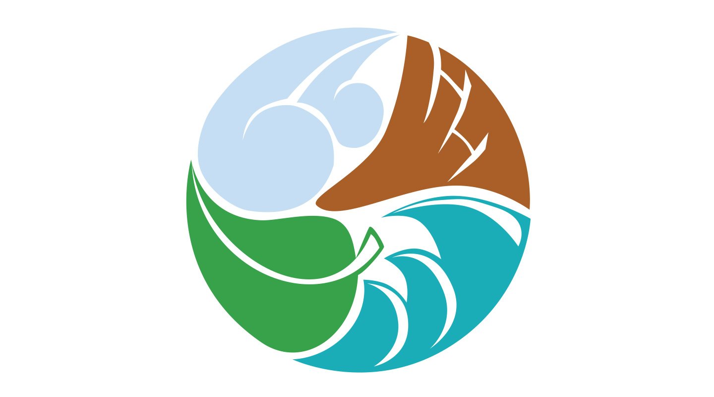
Miss Yvonne Ip from the first cohort of the programme is the designer of its logo. She explained that the curriculum focuses on systemic and interdisciplinary research of the Earth, which helps students understand its operation from spheres such as the atmosphere, the geosphere, the hydrosphere, and the biosphere. Accordingly, she outlined a cloud, the Earth’s crust, water and a leaf in white strokes, and coloured them in sky blue, ochre brown, ocean blue and green, respectively. As the four constituents are entwined into a circle, the interrelatedness and mutual influence of these spheres of the Earth system are vividly demonstrated.
The dynamic rotary logo design gives a touch of interactiveness. Its four constituents seem to be rotating at a glance, like the Earth in rotation. Such a natural dynamics echoes how everyone in the programme works together. When Yvonne began to design the logo for the programme, she received the full support from the faculty and administrative staff. She included the four cornerstone spheres of the curriculum in the first draft for their review. ‘My first draft was like a sketch, so Prof. Amos Tai suggested that I should use plain and natural strokes; Dr. Jason Zhang also advised me to characterize the Earth’s crust with “transform faults” instead of the clichéd mountain tops. Without their advice, we wouldn’t have a logo that captures our mission so sophisticatedly and so simplistically.’
Circles and spheres are perfect geometrical shapes. As early as 500 B.C., Pythagoras had already proposed a spherical Earth and other spherical celestial bodies. Like many Greeks, he believed the sphere and the circle were the most perfect forms. The ancient Chinese also equated circles with beauty. Rotundity implies ‘harmony’ in Chinese culture, which is the way of life commonly pursued. The round logo of the Earth System Science Programme imparts a sense of harmony of Man and Nature, doesn’t it?
This article was originally published in No. 495, Newsletter in Apr 2017.