Dear readers, With the launch of e-newsletter CUHK in Focus, CUHKUPDates has retired and this site will no longer be updated. To stay abreast of the University’s latest news, please go to https://focus.cuhk.edu.hk. Thank you.
Green Green Grass of Med
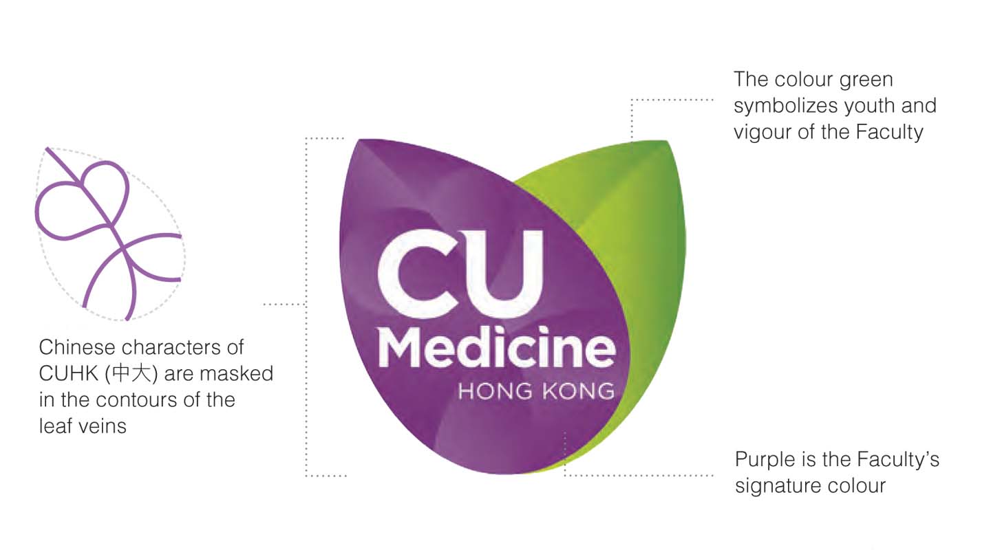
The logo of the Faculty of Medicine has been in use since 2013. It consists of two overlapping apricot leaves, bringing a refreshing vivacity to the Faculty’s visual identity. Apricot trees have come to symbolize the medical profession since the Three Kingdoms Period in Chinese history. Legend has it that Dong Feng, a skilled yet reclusive medical practitioner, did not charge his patients any fee for his service but asked them to plant apricot trees in return—five for the seriously ill and one for the less seriously ill. A forest of apricot trees in the thousands sprang up in a few years’ time.
One of the leaves in the logo is purple—the Faculty’s signature colour; the other one is green, symbolizing youth and vigour of the Faculty. If one looks closely at the purple leave, one can also find the Chinese characters of CUHK (中大) masked in the contours of its veins.
The idea of the logo came from Prof. Francis Chan, Dean of Medicine. Professor Chan explains: ‘The two apricot leaves have another connotation on top of the medical field. The pronunciation of apricot (杏) is akin to that of the word “fortunate” (幸) in Chinese. This is a subtle reminder to all of us at the Faculty that it is a privilege to be able to devote ourselves to the practice of medicine to serve people. Apart from appreciating the opportunity given by the University, we should make use of our expertise to pay back to society for the greater good of the people.’
One often sees a rod entwined with one or two snakes on the visual identities of most medical organizations. The one with one snake is known as the Rod of Asclepius. Asclepius is the God of healing and medicine in Greek mythology. In the 19th century, many medical organizations in the US began to represent themselves with a slightly different image—a rod with two snakes on it. Some variants even have a pair of wings above the rod. This is called the Caduceus, or the Rod of Hermes. (In Greek mythology, Hermes is the messenger of the gods and the protector of travellers). The leave design of the Faculty of Medicine is refreshing and pleasing to the eye, a confident departure from the asklepian or the Caduceus that truly embodies the distinctive tradition of the Chinese University.

This article was originally published in No. 482, Newsletter in Sep 2016.