Dear readers, With the launch of e-newsletter CUHK in Focus, CUHKUPDates has retired and this site will no longer be updated. To stay abreast of the University’s latest news, please go to https://focus.cuhk.edu.hk. Thank you.
Not Just Dispensing: School of Pharmacy
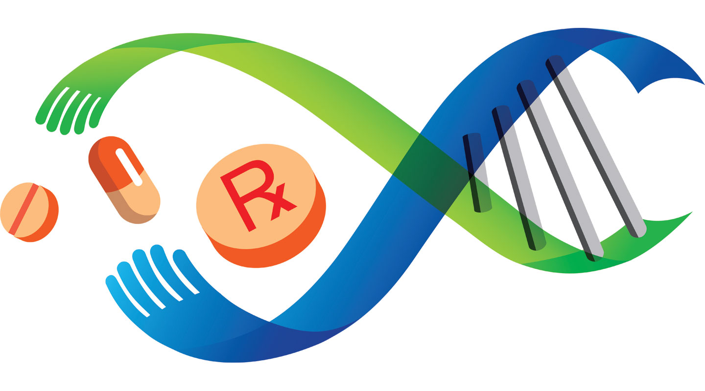
A mortar and pestle is a common symbol of pharmacy, and has long been adopted in the logos of pharmacy schools and pharmacist organizations worldwide. The paired instruments were an indispensable set of tools pharmacists used to compound prescriptions before the advent of mass drug manufacturing. However, when the School of Pharmacy of CUHK set out to refresh its brand in 2006, it chose a path less travelled and created an unconventional artwork.
Its basic framework is a double helix, consisting of a green and a blue strand that wind around each other. The shading of the overlapping surfaces creates the illusion of three-dimensionality. ‘A double helix as the core of design recognizes the impact of molecular biology on unravelling the complexity of disease and on igniting a therapeutic revolution resulting in precision medicine,’ explained Prof. Vincent Lee, former director of the School and also designer of the logo.
On closer look, the left ends of the strands are two hands almost touching. It can be interpreted as the interdigitating of art and science in customizing pharmaceutical care to meet the needs of the patient, or as the joint efforts of the School’s students, staff and alumni to make the world a better place. ‘I wanted the logo to be a conversational piece, so that it can be a barometer of the viewer’s perception of the pharmacy profession,’ said Professor Lee.
Not only do the two arms form a double helix, but together they also constitute the symbol of infinity, meaning there are always more to explore.
In between the two hands are a tablet and a capsule, two most common forms of medicine today. There is also a bigger pill with the imprint ‘℞’. ‘℞’ is a short hand for the Latin imperative recipere, meaning ‘take’. In the medieval times, it was a directive to the pharmacist to ‘take’ a set of ingredients to make up the drug by hand. The symbol has come down to us as one of the Latin abbreviations that we continue to use to signify ‘prescription’ and sometimes even ‘medicine’ in a generic sense, and is widely seen on the storefront of many dispensaries in Hong Kong.
Although pharmacists are most often associated with drug dispensing, their role keeps evolving. As Professor Lee said, ‘The logo is a statement of the School’s intent to modernize the pharmacy profession by developing the requisite confidence, courage and sophistication in her students. Caring for the sick and disadvantaged in a patient-oriented way will become second nature to them.’
Christine N.
This article was originally published in No. 501, Newsletter in Aug 2017.